How to Choose the Best Office Paints?
Are you in the process of redesigning or just designing your office from scratch? No matter how many times you will get a redesign done for your office, it should always resonate with your aura and give off the energy you wish to feel every day you enter your workplace.
Consider the psychological impacts that paint color can give when thinking of the best office paints. Let’s get into the top suggestions of which paint you should go for your office.
Office Paints According to Designers
- Blue is a Color of Mental Clarity:
If you get your office interior design incorporating the color blue in it, you surely will get relaxing vibes and professional ones when you are in your office. The blue color also inspires creativity, and hence it is one of the most popular colors used in interiors of offices and different workplaces.
Less stressed workers also tend to enjoy their jobs more and give more productivity levels; hence blue is a top choice of many.
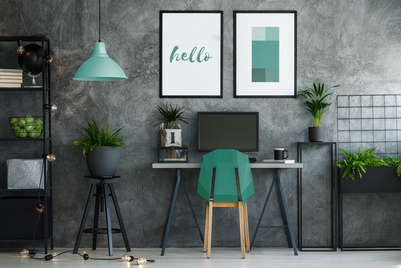
- Blue-Gray Gives Calmness:
This paint color shows a very calming and restive effect conducive to having a good work vibe. You can get this color anywhere on the walls or the future workplaces. This color will cool off the buzzing office environment and make everyone relax a bit.
You can go for this color as your major color element in your office and let it show a professional look in there.
- Chartreuse Green:
Chartreuse is a highly energetic and refreshing color in any office where creativity is the main one. This office will include a wall painted in this shade of green which can be repeated in many storage units or cabinets having white as the accent color.
Other greens are also getting popular, mostly found in house decors. Blues have a dominancy, but the nurturing greens assist workplaces and offices feel a lot more inviting. This is one of the top Office Paints According to Designers.
- Chartreuse Yellow:
The value of Chartreuse is more of a reflective spring, youth, and renewal. You may often find it as a favorite paint color in tech companies and the rest dedicated to innovative products and ideas. Use earth colors such as gray, brown, and beiges to keep this bright shade from overpowering your office interior design.
- Textured Marigold:
Yellow is another paint color that might seem too powerful in any office. It is thought of as the most intense color of the spectrum in the human eye. If you pick to use shades of yellow, then go for bright yellows.
You might also prefer using a yellow accent wall or the panel instead of a whole office. This marigold is used along with beige to define the open office spaces. You can mix and match and create the best office paint colors for you as you please.
Conclusion
These are some of the top office paints according to designers, that you can use to make them one huge creativity hub. The colors we see around us affect us psychologically, and your office paints will also cause a similar impact on you and your fellows at work; hence you should choose wisely.